INTRODUCTION: WHAT IS LIBERATURE
Of all the words appearing in the title of this paper(1): Joyce, writing and book are familiar enough, but the middle term probably looks as if it were either a misprint (of literature) or a Wakean word. In fact, it is neither, but in order to explain what it means I need to start from literature and finish with Finnegans Wake.
Although we all seem to know what literature is, let me begin with providing its dictionary definition. Webster defines it as: 1) writing in prose or verse regarded as having permanent worth through its intrinsic excellence; 2) the entire body of writings of a specific language, period, people, etc.; 3) any kind of printed material.(2) This unequivocally identifies literature with writing, which is no less than a visible, material form of language – embodied in marks traced with a pen, pencil or another instrument on a hard surface. However, literature has long been identified with the spoken medium. Its origins were sought in oral tales, songs and incantations, so for many scholars it has been akin to music rather than to so called “spatial arts” (such as painting or sculpture). Writing has been considered merely an imperfect record of oral expression, an inevitably corrupted reflection of an unrealisable ideal. Plato dramatised this condescending attitude in Symposium, which is an account of what Apollodorus remembered from what Aristodemus repeated about what Socrates’ and his interlocutors had said. In this account successive stages of corrupted transmission find their anti-climax in the written form of the dialogue, which Plato openly attacked in Phaedrus.
Literature as an oral-aural art has had some other influential proponents, including an 18th century German thinker Gotthold E. Lessing, who in Laocoon, a consequential treatise on the nature of arts, set out to analyse critically a classical dictum that “poetry is a speaking picture, and painting dumb poetry” (ut pictura poesis). Pondering on the intrinsic features of the media of both arts, he concluded that literature (which he identified with poetry), employing sounds articulated in time, must by its very nature belong to the temporal arts, while painting, expressing itself in figures and colours, is of spatial nature.
But by an ironic coincidence Lessing’s essay appeared in 1766, the very same year in which Laurence Sterne’s Tristam Shandy questioned his assumptions. If literature is executed in “articulated sounds”, several features of Sterne’s novel defy such articulation. How should the reader possibly utter the black or the marble page or the looped and straight lines? Should the double column chapter be read by two readers simultaneously, and wouldn’t such a reading add some spatial feature to it anyway? Yet the inescapable materiality of Sterne’s novel did not prevent the outstanding Polish philosopher Roman Ingarden from claiming two hundred years later that only the work read aloud achieves its full actualisation and only in reading aloud can it be fully appreciated.(3) For Ingarden ‘reading’ the literary work was essentially tantamount to ‘hearing’ it, while the book was an ignorable material foundation and the text a kind of “musical score”.
Such a concept of literature must necessarily exclude a whole body of works such as figural poetry, modernist avant-garde publications, or Mallarmé’s famous poem The Throw of the Dice (Un Coup de Dés) to provide a specific example. Consequently, literary texts which exploit the visual and spatial features of the written medium are treated either as trivial games or some sort of deviation and exiled to the margins of literature. But it was precisely Mallarmé’s above metioned poem, which, while exploring the idea of poetry as music, resulted in a radically spatial (and visual) work. The French poet designed The Throw of the Dice as a quasi-musical score. In the foreword to its magazine publication he indicated that different sizes and positions of words on the page are supposed to guide the reader’s performance: words in capital letters are to be uttered more loudly and forcefully, those lying at the top of the page represent a high pitch and those at the bottom low pitch and “the range or disposition of characters, in the middle, at the top, or at the bottom of the page, marks the rising and falling of the intonation”.(4) Blanks indicate the length of silence between verses, whereas roman type and italics are visual equivalents of two different tones or voices. The force of the voice, i. e., the size of the typefaces, may indicate the hierarchy of ideas in the poem, while different typefaces might convey uncertainty: “AS IF/ An insinuation / simple / in the silence / enrolled with irony / or / the mystery / hurled / howled”, or hesitation and anxiety: “THE MASTER /.../ hesitates /.../ formerly he would grasp the helm / at his feet / from the unanimous horizon” (Mallarmé, 134, 130; to see this at work compare the original layout of the respective pages reproduced below).
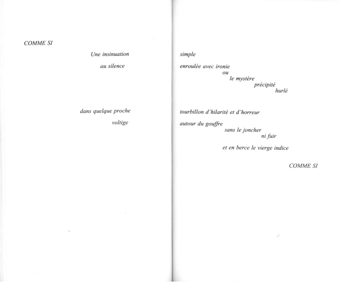
Fig. 1a S. Mallarmé, Un Coup de Dés jamais n’abolira le Hasard, in Poésies et autres tertes (Paris: Le Livre de Poche, 1998), pages 266-67.
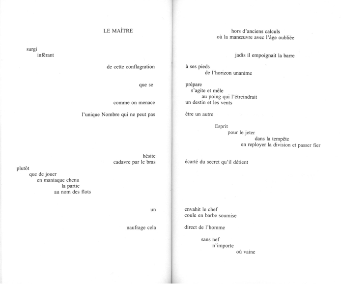
Fig. 1b. S. Mallarmé, Un Coup de Dés jamais n’abolira le Hasard, in Poésies et autres tertes (Paris: Le Livre de Poche, 1998), pages 262-63.
Of course, the reader may consider such a poem “madness / of the memorable crisis”; in other words, he may reject it as an extreme case of experimentation, resulting in failure: “some splashing below of water as if to disperse the empty act / abruptly which otherwise / by its falsehood / would have founded / perdition” (Mallarmé, 142). On the other hand, this new poetic language can be seen as the source of “power” for the poet who draws his creative energy from the material medium he is working with. Mallarmé seems to hint at the dual: aural-oral and visual nature of the poetic language also in his “The Afternoon of Faun”, where he writes that: “Exhaled from twin pipes (...) / The melody in arid drifts of rain / Is the visible, serene and fictive air / Of inspiration rising as if in prayer” (Mallarmé, 38). The French poet realised that due to an unorthodox use of typography the oral-aural became visual, spatial and material, which turned The Throw… into a unique textual object. This poem cannot be printed in any other form: it must always have the twenty-one specifically laid out pages because otherwise its content and meaning is distorted.
The Throw was a by-product of Mallarmé’s grand project of The Book, which was to be a kind of total object that would integrate all imaginable aspects of writing and reading processes into an organic whole (Mallarmé even planned the price of the book, and designed the library space where the book would be placed and read). Although being just a fragment of a greater work, it may give us some idea of what his Livre might look like. As he makes it clear in the Preface to the poem, Mallarmé was aware that he opened up a new poetic territory, and hoped there would be others ready to explore it.
A part of this new (or not so very new, as we have seen) literary territory was theoretically tackled by an American scholar Carl Darryl Malmgren in Fictional Spaces in the Modernist and Postmodernist American Novel (Lewisburg: Bucknell UP, 1985) and identified and named by a Polish writer and artist Zenon Fajfer. In his book Malmgren provides us with a neat schema of all aspects of fictional space (cf. Fig. 3 below) which he splits into two areas: the textual space, i.e., the product of the author, and the paraspace, i.e., a dynamic field in which the text and the reader come into an interaction. Within the textual space he differentiates the iconic space which embraces all the elements of the literary work in which there is a physical correspondence between the signifying and the signified, “which therefore draw the reader’s attention to the materiality of the fictional discourse” (Malmgren, 45). He distinguishes its four sub-levels: the alphabetic, lexical, paginal and compositional ones. The alphabetic space involves the employment of devices exposing letters as meaningful elements (e.g., acrostics, anagrams, palindromes, etc.). The lexical space is founded on conspicuous lexemes such as puns, rare, opaque or foreign words. The paginal space exploits typography of the page (or pages verso and recto) as a meaningful device (we see that in Mallarmé’s poem). And compositional space characterises works whose overall shape (again like in the case of The Throw or Sterne’s Tristram Shandy) was designed by their authors.

Fig. 3 (click to zoom) A map of fictional space by C.D. Malmgren (1985: 60) with an inclusion of liberature suggested by K. Bazarnik (2005)(5)
Presenting his theory, Malmgren points out to some theoretical possibilities arising from his mapping of fictional spaces. They include a typology of iconic texts and definition of genres. His own discussion of several post-modernist American novels proves persuasively that iconic elements of these works are, on the one hand, rooted in visual/spatial qualities of writing and print, and, on the other, indicates that the paginal and compositional space can be a stylistic feature so prominent that one might feel tempted to speak of a distinct literary form or genre. It seems that while shaping these two types of iconic space, the writer must to some considerable extent also design the book, thinking out its typography and its material form, thus, these aspects which have been hitherto considered accidental to the literary work. In other words, the writer may decide to employ its bibliographic code to the work of signification. If this is the case, we are dealing with the literary work that cannot be properly understood and appreciated if its material and artefactual aspect is ignored.
In 1999 Zenon Fajfer suggested that such works which integrate the text and its material medium into an organic whole should be indeed seen as a distinct literary genre, which he called “liberatura” (in English “liberature”; after Latin liber, i.e., “book”) to emphasise the form of the book as their meaningful aspect.(6) Thus, the material form of the book and everything it entails: its shape and structure, format and size, layout and typeface, kind and colour of paper, illustrations, drawings and other graphic elements may function as meaningful components of the work. Fajfer suggests that the author should be free to choose whatever means and materials he finds appropriate (which alludes to Latin liber meaning ‘free’(7)). But the writer may deliberately choose to employ traditional conventions if he finds them adequate to his aesthetic or expressive aims. However, in such a framework the book is neither a transparent container for the text, nor an ignorable material foundation (as Ingarden wanted), but becomes a significant component of the literary work of art. Beside stemming from a reflection on various unconventional books, including Joyce’s Wake, Fajfer’s proposition was founded in his own creative work, as he is the author and co-author of several works that combine spatial and visual qualities of the book with its linguistic content. It was, in fact, his Oka-leczenie, (which I co-authored) which was the first book to be called liberary.
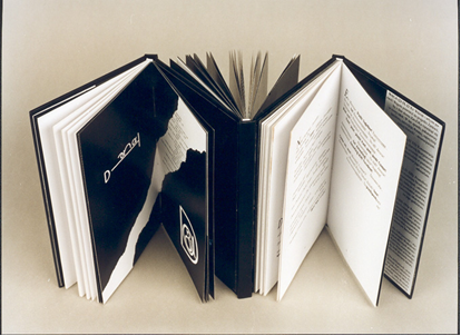
Fig. 4. Z. Fajfer and K. Bazarnik, Oka-leczenie, a triple-codex book (prototype edition, Krakow, 2000).
The liberary (or liberatic, as it is sometimes called) perspective can throw some light on Joyce’s works and account for those of their features that have been either ignored or treated as accidental until now. Especially that Joyce’s literary affiliations were, among others, to Laurence Sterne and William Blake, those masters of the book construction, and if there was one part of the Irish heritage which Joyce truly cherished, it was the Book of Kells.
GIACOMO JOYCE
Striking similarities between Mallarmé’s poem and Giacomo Joyce were noticed already by Richard Ellmann, who felt that the poem could not be properly appreciated without resorting to its actual, physical form. So he decided to include facsimiles of several manuscript pages and use the original handwritten label on the notebook as the title of its published version. However, an inappropriate format did not allow him to preserve full correspondence between the original and printed texts. Ironically, in his preface he commented on the visual rendering of an interplay between voice and silence on those very pages his edition misrepresents (see Fig. 5a, b). Nevertheless, he recognised the material form as potentially meaningful, stating that “[i]n the final act of writing, the appearance of the work on the page may have become an element of its substance”.(8)
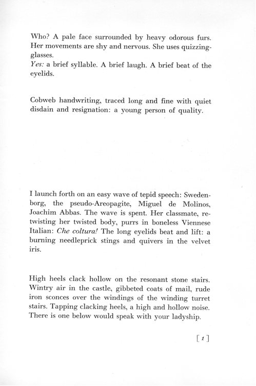
Fig. 5a “Mechanically reproduced” page 1 of Giacomo Joyce edited by R. Ellmann.
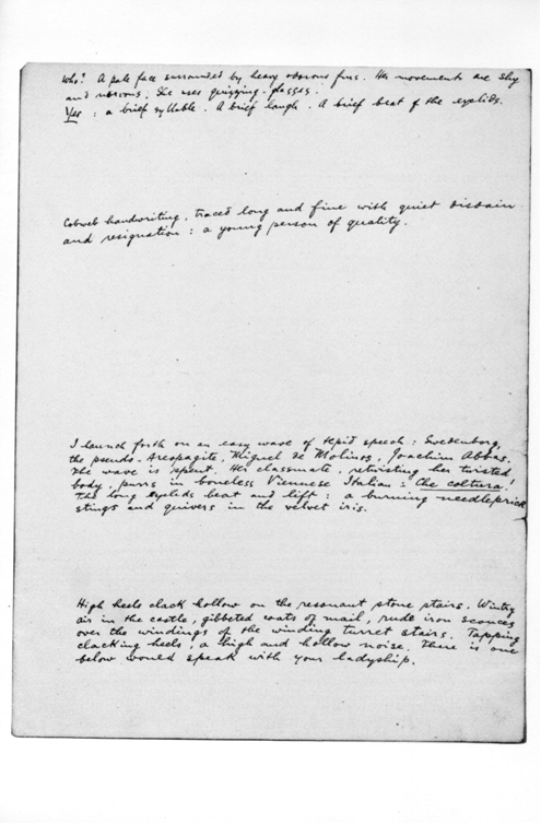
Fig. 5b. Reproduction of the original, handwritten page 1 of Giacomo Joyce notebook in Ellmann’s edition of GJ.
Since then most scholars writing about Giacomo Joyce have commented on its manuscript form as bearing on the poem’s meaning. As John McCourt notes, they have become increasingly aware that the poem should be seen not as “a graphically conventional piece of writing but as a manuscript to be viewed through the lenses of visual arts”.(9) Thus, Donatella Palotti refers to it as “a visual encounter”,(10) Louis Armand speaks of “objecthood” as its inherent quality,(11) Giuseppe Martella sees it as a “text designed to be perceived in its material body”,(12) and McCourt himself calls it “a visualogue”, that is, a work characterised by a “bi-modal representation” which must be analysed in both linguistic and visual terms.(13)
The layout of the poem enhances its verbal message as the fluctuation of blocks of text and blank spaces prepares the reader for the fluctuation of scenes, images and voices in the poem. “Why” is the text interspersed with stripes of whiteness? “Because otherwise” the reader “could not see”. Constituting 60 % of the whole textual surface and visually dominating nearly every page, the blanks invest the work with as much meaning as words, informing the reader about the nature of Giacomo Joyce as “discrete, discontinuous, nonlinear, irregular, mutable, dynamic....”(14) However, as we have said, due to the standardised format, Ellmann’s edition does not fully render this in print. It tries to make up for the loss by providing photocopies of the original text. But Frattarolli noted that only in the manuscript form “GJ conserves an aura of uniqueness, of ineffability, of irremissible corporeity”, adding that “only in its manuscript state is the text given in all its expressive integrity.”(15)
Its editorial history and its physical distinctiveness have contributed to its unclear and marginal position among Joyce’s works. It has been usually described as a transitional piece, a carefully laid out bunch of epiphanic fragments which do not necessarily imply a whole, a poetical diary or an exercise in style.(16) Yet its physical features belie an assumption that it is a random collection of notes: the careful handwriting, and arrangement of passages and blanks, though foregrounding the fragmentariness of experiences and of impression, imply a deliberate design and some kind of unity, too; also because the sheets were placed between the covers of the (note)book. In this respect Giacomo Joyce resembles, if not anticipates, such books-in-the box as, e.g., B.S. Johnson’s The Unfortunates, the novel which deals with a similar theme: that of random recollections and mechanisms of memory. Fragmented, incoherent memories, as if remains of the friendship between the narrator and his dead friend Tony, are printed on loose sheets and placed in a box as in a coffin. Likewise, Giacomo Joyce records impressions and recollection that could hardly be expressed openly and arranged in any logical story. Like “[a] long black piano: coffin of music”, this elegant little booklet is both a memento of past enchantments and “[a] form of speech: the lesser [presence of the visible] for the greater [absence of the audible]” ? “coffin of voice” (Giacomo, 16, 2).
If, as we noted in the beginning, the prevalent tradition sees the substance of literature in the voice, paradoxically, in Giacomo writing becomes its other. So, to use Louis Armand’s phrase, we could see it as a true envoy of the Other: that “cobweb handwriting” which traced and recreated the movement of the eye. Could we, thus, see it not as hesitating between genres and textual placements, but as a unique textual object in its own right that could be counted as “liberature”?
ULYSSES
If all Joyce’s works were put on a cline whose one extreme were Giacomo Joyce, Ulysses would occupy the other extreme. Totally unlike the singular manuscript of Giacomo Joyce, Ulysses does not exist in any canonical form. It is known to the reading public in several, significantly different editions and, despite repeated claims, none of them is “definitive”, “authoritative” or “correct”. But its publishing history shows how the author struggled for the textual and material integrity of his work and how he ultimately yielded to overwhelming circumstances. Without going into details, let us only notice that its first edition prepared under Joyce's supervision possessed some features which coordinated its material shape with its verbal content in a way unique to that edition and its subsequent eight printings, and was repeated only in the Oxford reprint of the 1922 text published in 1992.(17)
One of the best-know details of this coordination was the colour of the cover in the blue of Greek flag, which Joyce chose very carefully and insisted on preserving in all subsequent editions issued by Shakespeare and Company.(18) Another important detail worth remembering is that Joyce wrote nearly a third of the final text on the galley and page proofs. This gave him a unique insight into the structure of the book, and he took an advantage of it. As Michael Groden claims, many of his additions at that stage developed chains of cross-references that form symbolic and verbal networks running throughout the novel.(19) Some of Joyce’s very late additions seem to bind the linguistic content specifically with the space of the book as if to enhance their organic unity. For example, the insertion of the headlines in “Aeolus” not only indicates the setting (both the newspaper office and the layout of a newspaper), but also visually separates chunks of text with blank spaces, thereby forming “typographic” Aeolian islands. The layout of the chapter becomes a diagrammatic icon of the episode’s mythical setting. Such diagrammatic correspondences can be found in other places, too. For example, on page 77 “Seventh heaven” was inserted as the seventh sentence in a paragraph where Bloom muses on what people feel taking the holy communion. On page 88 Joyce added: “Aged 88 after a long and tedious illness” to an obituary Bloom is scanning. When Bloom is thinking about weight, gravity, and the rate of falling bodies, he recalls its value: “thirty two feet per second”, in the thirty-second sentence of the paragraph. And in “Calypso” the punctuation of Milly’s letter was so modified as to contain fifteen sentences.(20) Bloom was struck by a coincidence between Milly turning fifteen on the fifteenth of June, the day she wrote the letter. The sentence pattern may appear as yet another concurrence (which “incidentally” escaped Bloom) but such an accumulation implicates an intentional activity.(21)
If one pursued such numerology further, one could notice that the first edition of the novel counts 732 pages. This is the number of nights and days in the leap year; coincidentally, 1904, when Ulysses is set, was a leap year, too. Besides, the diurnal and nocturnal halves of the book are equal: the dawn falls exactly on pages 364-5. “Done half by design” thinks Bloom at that moment, reflecting on the shape of the Dublin Bay. “Now if you were trying to do that for a week on end you couldn’t. Chance,” he adds, commenting silently on the stick which he threw and it stuck upright in the sand. But it is also that very moment when he considers writing a message on the sand to Gerty, and begins with: “I. (…) AM. A.”, which hints at another, greater presence behind his fictional back, the presence that directs the movements of both his wooden pen and his reflections on the shape of the landscape in front of his eyes.
Admittedly, few scholars are convinced that Joyce could have engineered this with such a precision. Some claim that Ulysses was not finished as such, but rather “abandoned”, because Joyce desperately wanted to keep up to the deadline of his birthday.(22) But, undoubtedly, he had had an insight into the structure of the book while the text was typeset. Considering his long-time experience with the page proofs, he could have had ways of imposing such number symbolism on the novel. So, if he had hit upon that idea, adding as much text to the last episode as would be necessary seems to be a way of ensuring that. Interestingly, as late as in September 1921, Joyce informed Frank Budgen that the version of “Penelope” he was just working on was “only a draft” and “a great deal will be added or changed on 3 page proofs.”(23) And the very last addition sent to Darantiere only two days before the official publication contained extensive passages added precisely to “Penelope”, which provoked Groden’s surprised comment about Joyce’s strategies.

Fig. 6 Reproduction of one of the pages in “Penelope” with Joyce’s substantial additions and Groden’s surprised comment (in Groden, ULYSSES in Progress, 192)
But even if the ultimate result of resetting the episodes was indeed coincidental, Joyce noticed and happily embraced it, as his “thank Maurice” and the allusion to the number of the pages of Ulysses in Finnegans Wake (FW 123.04) indicate.(24) These words of gratitude appear at the end of the analysis of the letter in chapter 5 of Finnegans Wake in the following passage:
…the toomuchness, the fartoomanyness of all those fourlegged ems: and why spell dear god with a big thick dhee (why, O why, O why?): the cut and dry aks and wise form of the semifinal; and, eighteenthly and twentyfourthly, but at least, thank Maurice, lastly when all is zed and done, the penelopean patience of its last paraphe, a colophon of no fewer than seven hundred and thirtytwo strokes tailed by a leaping lasso — who thus at all this marvelling but will press on hotly to see the vaulting feminine libido of those interbranching ogham sex upandinsweeps sternly controlled and easily represuaded by the uniform matteroffactness of a meandering male fist? (FW 122.36-123.10)
It contains references to several other features of the first edition of Ulysses. The book consists of eighteen episodes stretching over 24 hours of one day and night and reflects the 24 books of The Odyssey. Its size must have been carefully calculated in ems(25) by Maurice Darantiere, the printer of Ulysses, and, as we have said, amounted to 732 pages. It closes with a unique, non-punctuated episode, an unmistakable “paraph” of the novel, preceded by “the cut and dry aks and wise form of the semifinal” chapter of “Ithaca”. “Penelope”, this most “feminine” of all Ulyssean fiction, the verbal record of Molly’s libidinal reflections, was as “sternly” controlled as the whole book, which Joyce mentioned in another letter to Frank Budgen.(26) Besides, “sternly” evokes Laurence Sterne, another writer who controlled the printed body of his books, and inextricably bound their bibliographic and textual layers. Some features of the Wakean manuscript remind us of his Tristram Shandy: the “final droopadwindle slope of the blamed scrawl, a sure sign of imperfectible moral blindness” (FW 122.34-36), and “a leaping lasso” closing the document allude to meandering, looping lines graphically representing the shape of Shandean narration.” (Sterne, Tristram Shandy, chap. XL, vol. 6). So it seems quite evident that Joyce saw the bibliographic features of that edition of Ulysses as worth mentioning, possibly even as meaningful elements of his work. In this context it is interesting to note Jeri Johnson’s comments on how Joyce referred to it: “[he] began by calling it a novel, soon abandoned this for ‘epic’, ‘encyclopaedia’, or even maledetissimo romanzaccione, and finally settled simply for ‘book’”(emphasis KB).(27)
WRITER’S BOOKS
It is also worth pondering a while on his minor publications brought out between the appearance of Ulysses and Finnegans Wake: ALP (Paris: Crosby Gaige, 1928), HCE (New York: Fountain Press, 1930; London: Faber, 1931), Tales Told of Shem and Shaun (Paris: The Black Sun Press, 1929), Two Tales of Shem and Shaun (London: Faber, 1932), The Mime of Mick, Nick and the Maggies (the Hague: the Servire Press, 1934), Storiella as She Is Syung (London: Corvinus Press, 1937) and even Pomes Penyeach (Paris: Shakespeare and Co., 1927; Obelisk Press, 1932). In each case the booklet was very carefully designed and its production closely supervised by the author. The printing was usually executed in small presses, specialising in limited, bibliophilic editions of “fine books” or so-called artist’s books. The publication was usually issued in two limitations: one, cheaper and less refined, for sale, the other, more exclusive, for family and friends. In the latter and to some extent in the former, Joyce coordinated the linguistic content and its material embodiment so that they would complement each other. Though sharing some of the qualities of artist’s books, Joyce’s fine booklets should be rather seen as “writer’s books”: that is, books in which it was the writer who consciously co-created their design to comply with his aesthetic and expressive purposes (unlike in artist’s books in which it is commonly a visual artist who uses a text merely as a pretext for his/her graphic work).
So Anna Livia Plurabelle was rather modest in size (12 x 18 cm) to underline the humble nature of its protagonist, and bound in brown cloth to remind one of the muddy waters of its namesake Anna Liffey, the Dublin river.(28) It bore an inverted triangle, ALP’s “muddy old triagonal delta, ...first of all usquiluteral threeingles”. Her male counterpart, Haveth Childers Everywhere, had a format appropriately larger to reflect HCE’s imposing statue. A multiplicity of paper types and different bindings used in its four different limitations, including simple white paper, glassine wrapper, and green slipcase gilt on edges, may be read as reflecting the multiplicity of HCE’s incarnations, “whose published combinations of silkinlaine testimonies are, where not dubiously pure, visibly divergent, as wapt from wept” (FW 34.22-24), and their quality would point to an air of pompousness surrounding HCE’s giant figure. The contrast between the two books is so telling that the librarians of the Library of University of Tulsa felt obliged to remark that: “In Finnegans Wake, HCE is ALP’s complement and the format of the books reflects the characters whose stories they tell: HCE is as exaggerated as ALP is diminutive.”(29) And this is what Luca Crispi and Stacey Herbert wrote about ALP in the catalogue of the exhibition “In Good Company. James Joyce and Publishers, Readers, Friends” held at Tulsa in 2003: “Joyce’s conception of the tone, appearance and format of this integral fragment of his Work in Progress was already well-determined. Joyce asked that the binding be turf-brown and he had already secured an introduction by his friend Padraic Colum because, as Beach said, “otherwise the intention and position of this piece in the entire work will be open to misinterpretation.”(30) And they suggest that Joyce had his ideas, too when it came to HCE. They quote Beach’s upublished letter to Wells (14 Nov. 1929, MS at Buffalo), saying that: “[o]n account of the self-glorig tone of old Earwicker, the format should be gaudy and aggressive, within artistic limits, as ALP was sober and unassuming.”(31)

Fig. 7 Anna Livia Plurabelle as muddy, brown Liffey and the Black Lady (Rio Negro), Crosby Gaige, 1928
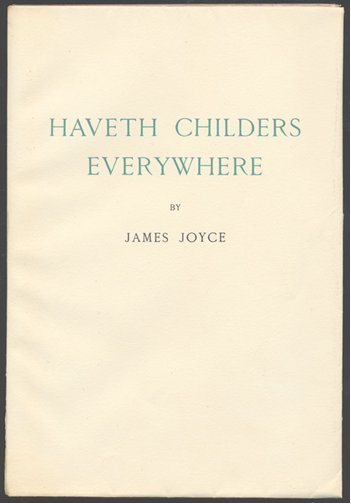
Fig. 8 Haveth Childers Everywhere, Fountain Press, 1930 (the relative proportions of both booklets have been preserved)
As if to match the parental figures Joyce brought out their offspring: Two Tales of Shem and Shaun, The Mime of Mick, Nick and the Maggies and Storiella as She Is Syung. Of special interest among these is The Mime (along with Storiella) illuminated by the author’s daughter Lucia. Joyce not only inspired the graphics, but also played on the number symbolism associated with the content of the book. The Mime was issued in two limitations: of one thousand market copies and of twenty-nine copies not intended for sale, printed on exclusive Japanese paper. Issy, the daughter-figure of FW, is characterised by a split personality and appears in The Mime in twenty nine leap year girls’ incarnations. It is clear that the special limitation represents her multiple personality.
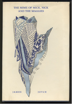
Fig. 9 One of the twenty-nine special copies of The Mime of Mick, Nick and The Maggies.
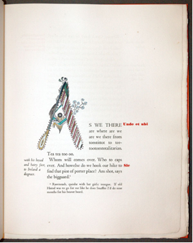
Fig. 10 The first page of Storiella as She Is Syung.
Although not a part of Finnegans Wake, equally interesting in these respects is Pomes Penyeach, which included thirteen short poems: twelve of them with titles referring to the content of each poem and the thirteenth one entitled “Tilly”, as in the phrase “twelve and a tilly”, where it indicates a bonus. The colour of the cover was to be pale green to recall the colour of the eponymous apples. The price of the book was symbolically associated with its content: it was sold for 12 Francs in France, and for 1 shilling (that is, twelve pence) in Britain so that each poem cost one Franc or pence respectively, and “Tilly” was offered for free. What is more, thirteen copies of this edition were printed on handmade Dutch paper, numbered accordingly, signed by the author and distributed among friends. Even the format was coordinated to fit the numerical symbolism: the thirteen booklets were in the form of a square of approximately 13cm long side. The regular trade edition contained a note about this exclusive series, additionally drawing the reader’s attention to the play on numbers.
Pomes Penyeach was published once more during Joyce’s lifetime by the Obelisk Press of Paris in 1932. This was the most beautifully designed of all his books, printed on specially imported Japanese paper (called Japan nacre or iridescent Japanese vellum). It consisted of nine loose folio sheets, folded and laid one within the other, placed in a portfolio bound in pale green silk. The poems were printed in black on recto of each leaf, in facsimile of Joyce’s handwriting and opened with illuminated, multi-coloured initials designed by Lucia. Additionally, the pages were interlaid with sheets of transparent tissue on which the title and text of each poem was printed in green in the lower left-hand corner. The book appeared in 25 numbered copies, six additional were made “hors commerce”, possibly to make the overall number 31, the reverse of 13 (however, this time the price amounted to 1000 Francs, reflecting the effort and intricacy put into the book’s making). The title page bore a simple, handwritten inscription: “Pomes Penyeach / by / James Joyce”, gilt stamped in gold. This visually exquisite book should probably be classified as a specimen of the art of the book rather than a writer’s book, nevertheless, it confirms that its author was sensitive to the potential entailed in the bibliographic code.
Fig.11 Pomes Penyeach, Obelisk Press, H.S. Weaver’s copy burnt at the edges by a fire in her garage.
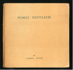
Fig. 12 Pomes Penyeach, Shakespeare and Co., large format 13 cm x 13 cm (the original colour of the cover has faded away).
The design of these minor editions testifies to Joyce’s holistic, or as I would like to call it, “liberatic” approach to his works. Whenever he was able to exert control over their every aspect, he did so, considering every element as potentially meaningful. That is why he was so fastidious about colours of covers,(32) types of paper, and even, sometimes, about the colour of print. His choices imply symbolic and iconic relationships between the linguistic content and material forms of his books, and emphasize the structural functions of certain motifs and numbers. In fact, Ellmann points out that Joyce’s defence of his artistic choices was grounded in (diagrammatic) iconicity when he stressed “the appropriateness of linguistic distortion to a book [FW] which traced the distortion of dream” and “the indivisibility of meaning from form” (Ellmann, JJ, 703, cf. also 716). Of course, Joyce also appreciated the musical qualities of his writing and did once remark that Finnegans Wake was pure music, but like Mallarmé, he must have realised that what he ultimately offered to the reading public was not an oral performance, but a kind of musical score, a graphic representation of sounds imprinted in a book.
“A MISEFFECTUAL WHYACINTHINOUS RIOT OF BLOTS AND BLURS”?
However, having seen his works into print, Joyce was already well aware how vain a desire to preserve their integrity may be. If the numerical symbolism of Ulysses happened to be “ulykkhean”, i.e., accidental (from Danish “ulykke” meaning “accident” or “misfortune”), it was happily incorporated into the author’s grand scheme. But if, as evidence suggests, it was he who engineered the bibliographic code of Ulysses to coincide with its content, the book turned out to be “ulykkhean” in the other sense, too, and the author became “easily repersuaded by the uniform matteroffactness of a meandering male fist” to yield to circumstances.(33)
Getting Ulysses into print was a frustrating struggle against time and adverse circumstances: “the hare and turtle pen and paper” race (FW 118.24), in which the apparently obvious winner inevitably had to fail. In Finnegans Wake all involved in the production of a book are called: “continually more and less intermisunderstanding (...) anticollaborators”. Spotting more and more alien interventions in his text Joyce must have realised the deceptive simplicity of the statement that: “somebody mentioned by name in his telephone directory, Coccolanius or Gallotaurus,(34) wrote it, wrote it all, wrote it all down, and there you are, full stop” (FW 118.12). Thus, the commentator warns us that “one who deeper thinks will always bear in the baccbuccus of his mind that this downright there you are and there it is only all in his eye” (FW 118.16). Once in print the book inevitably becomes “our social something”,
...[which] bowls along bumpily, experiencing a jolting series of prearranged disappointments, down the long lane of (...) generations, more generations and still more generations. (FW 107.32-35)
But although the text of the novel was extremely unstable and the production crew hardly reliable since: “every person, place and thing in the chaosmos of Alle (...) was moving and changing every part of the time” (FW 118.19-23), the commentator assures us that the document in question:
…is not a miseffectual whyacinthinous riot of blots and blurs and bars and balls and hoops and wriggles and juxtaposed jottings linked by spurts of speed: it only looks as like it as damn it; and sure, we ought really to rest thankful that at this deleteful hour of dungflies dawning we have even a written on with dried ink scrape of paper at all to show for ourselves, tare it or leaf it. (FW 118.28-34)
Beside implying “a method in this madness”, this also aims to draw the reader’s attention to the weight and shape of the container of the writing: the “tare” and “leaf” of it; let us note that “to tare” means “to take account of and allow for the weight of the container or receptacle”. Take it or leave it, the material artefact: “the proteiform graph (...), a polyhedron of scripture” (FW 107.08) is the point of departure for reading. And on page 109 we come across another comment suggesting that “the envelope of the text”, otherwise referred to as “the facts of feminine clothiering” or “feminine fiction” are always there and should be accounted for in a critical analysis.
FINNEGANS WAKE
Curiously, Finnegans Wake did not quite share the unfortunate lot of its predecessor. Despite its notorious elusiveness and extreme fuzziness, the publishing and, paradoxically, critical practices seem to imply a stability of Finnegans Wake as a textual object. Its subsequent editions, although admittedly containing some variations, have preserved the unmodified layout of 628 pages 36 lines each. One of very few attempts at modification was the “unconventional” edition brought out by Viking in 1959.(35) The text was reset and squeezed onto 540 pages of 41 lines. The 1959 Finnegans Wake, however, quickly turned out to be “unreadable” and fell into oblivion so complete that most Joyceans are totally unaware of its existence. Its “unreadability”, as Fritz Senn explained to me, consisted in its impracticality as an object of critical reading. “Nobody was able to find anything in it, so it was useless as a text”, said Senn. This is because readers got used to think of Finnegans Wake in terms of whole pages and see the book as consisting of a particular number of them, without even considering its possible implications. This condition was corroborated by the publication of Roland McHugh’s Annotations to Finnegans Wake, in which the spatial arrangement of notes and glosses reflects the spatial disposition of Joyce’s original.
It is interesting to investigate how the resetting resulted in unfortunate distortions. For example, the iconic image of the infinity (and, as Hart suggests, also of the mocking image of Platonic World-Soul) appearing in the standard editions on page 298 becomes totally illegible (see Fig. 13a, b):
... in the power of empthood be either
greater THaN or less THaN the unitate we
have in one or hence shall the vectorious ready-
eyes of evertwo circumflicksrent searclhers
never film in the elipsities of their gyribouts
those fickers which are returnally reprodictive
of themselves.
Fig. 13a An infinity sign or the figure of Platonic World-Soul interred in the textual landscape of FW (298.12-18)
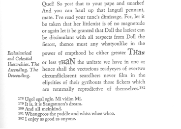
Fig. 13b Reproduction of a fragment of page 257 with a ruined iconic image of the World-Soul figure of Plato’s Timaeus in Finnegans Wake, New York: Viking, 1959
Moreover, and more importantly, the extension of the page size from 36 to 41 lines and, consequently, reduction of the overall size of the text, modified the bibliographic code in such a way that the potential numerical symbolism inherent in the standard editions was irreparably lost. Namely, if Finnegans Wake is as “circumformation”, or “the book of Doublends Jined” (double ends joined or blended ends joined; FW 599,17, 20.15), we can visualise it as a book opened in such a way that its covers are joined, while its radially extending pages form a circle, as in Fig. 14 below. The identity of the beginning and ending was also stressed by the fist edition’s bibliographic code, as the jacket bore identical lettering on both the front and back covers (cf. Fig. 15).
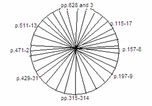
Fig. 14. “Our wholemole millwheeling vicocyclometer, a tetradomational gazebocroticon (the “Mamma Lujah” known to every schoolboy scallander...)” (FW 614.27-8)

Fig. 15. The first edition of Finnegans Wake (1939) with the original dust jacket; note the identical lettering of the front and back covers.
The circumference of this circle equals 628 (pages), a number which does not seem accidental at all, if we consider that the formula for the perimeter of the circle is pi multiplied by its diameter (or 2r, where r is the length of the radius). This can be summed up in a simple equation:
2r x 3.14 = 628
r = 100
But beside ruining this number symbolism, the 1959 edition would make it impossible to discover some geographic or geodesic correspondences that, I believe, permeate the original layout.(36) Their distribution, confirmed by Wakean “specious aristmystic” (293.18 produced the following model of the text as “Shapesphere” (295.04):
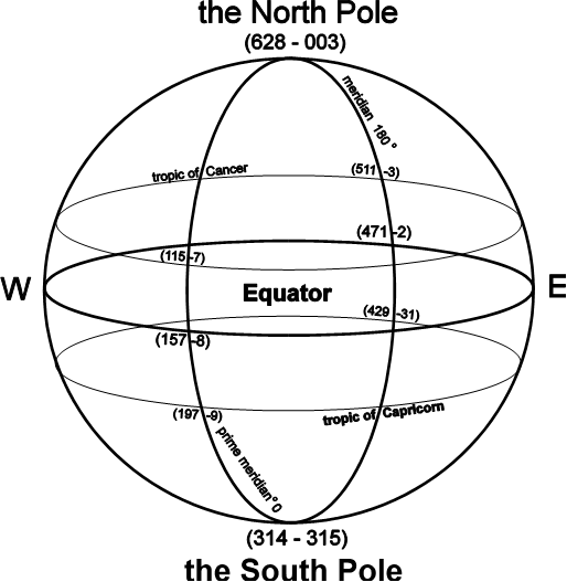
Fig. 16 gllll (... (...) ... (...) ...) lobe (FW 54.29 - 55.1)
Thus, for example, the textual area covered by pages 628-3 contains numerous references to such polar regions as: Lonely Island 627. 34, 628.15; Bering Sea and/or Bearing Strait, Bear Island (?) 628.7,9, Archangelsk 628.10, Murmansk 628.6, Thaddeus Islands 628.8, North America 003.5, Prince Patrick Island 003.10, Prince George Land 003.8, St. Lawrence Island (on the Bering Sea), 003.8, Ellef and Amund Ringnes Land and/or Ringnes Island 003.14, Bell Sound and Horn Sound on Spitsbergen 004.7-8. The central pages feature polar explorers: Shackleton and Amundsen, and polar expedition vessels: the Fram (312.7, 313.27, 315.30 (?), 317.9, Pourquoi Pas, Le France (315.34–6) and the Belgica (316.15–9). A last minute addition to page 117: “It is told in sounds in utter that, in signs so adds to, in universal, in polygluttural, in each auxiliary neutral idiom, sordomutics, florilingua, sheltafocal, flayflutter, a con's cubane, a pro's tutute, strassarab, ereperse and anythongue athall” (FW 117.15), may refer to the Tropic of Cancer running through Cuba, the Arabian Peninsula, and just below ancient Persia. While another, inserted on page 428,(37) mentions “our people in Samoanesia”, Samoa being the island on the southern Pacific lying in a close vicinity of the Tropic of Capricorn and the dateline.
As in the case of Ulysses, most of those significant geographic allusions were introduced to the text at very late stages of its development, already on galley and page proofs. One of such late additions explicitly identifies the cartographic character of ALP’s letter (and by extension, also the text of Finnegans Wake itself):
And watch would the letter you’re wanting be coming may be. (...) Every letter is a hard but yours sure is the hardest crux ever. (...) But once done, dealt and delivered, tattat, you’re on the map. Rased on traumscrapt from Maston, Boss. After rounding his world of ancient days. (FW 623.29-624.01)
This was added to galley proofs as late as in the autumn of 1938.(38) Genetic research provides us with yet another interesting detail. One of the passages sketched by Joyce as early as in winter 1923-24, explicitly speaks about a possible “geographic intention” of the Wakean letter. It was drafted as a longer chunk of continuous text, with only one modification: a change from “geographical” to “geodetic” (below is the transcript of the passage):
...let us now consider or any after all met with misfortune see all thereabout half. One cannot help noticing that some of the lines run from E to W, others from N to SR. Such crossing is antechristian though the explanation may be geographical [geodetic] quite as easily as domestic economic. Then, in addition to the original sand pounce or soft rag, it has acquired accretions of terricious matter while loitering in the past. The teastain is a study in itself and its importance in establishing the identity of the writer complex (for if the hand was one the minds were more than so) will be appreciated by remembering that after in the time before and after the battle of the Boyne it was the custom not to sign any letters always. For why sign when every word, letter, penstroke, space, is a perfect signature in its own way.
These ruled lines along which the traced words can run, march, walk, stumble in comparative safety seem to have been first of all drawn in a pretty checker with by using lampblack + a blackhorn.
(JJA, vol. 46, 299/ MS 47471-40b)
The switch from “geographic” to “geodesic” indicates a shift from the graphic representation to mathematical calculations, since geodesy is the branch of applied mathematics dealing with measurements of the shape and size of the earth and determining the exact positions of geographical points. The shift implies a deliberate distribution of geographic signposts according to mathematically verifiable principles. Consequently, the book can be seen as an iconic model of the earthly globe (as presented above in Fig.16), with the South Pole in the arithmetical middle of the text (where, apart from the above mentioned references, one can come across the greatest condensation of Polish (and Slavonic words, and… a missing punctuation mark on page 315), the North Pole at the other “end”, on pages 628-3, and the other mathematically determinable signposts in respective textual areas.
It was already Clive Hart, who was convinced that Joyce's ‘intention may have been geodetic’ indeed. “Finnegans Wake is laid out like a map of the globe – ‘a chart expanded’ (593.19) – for geography is as important to Joyce as history”, he wrote in Structure and Motif.(39) In II.2 the twins finish their “imaginable itinerary through the particular universal” (FW 260.R3), concluding that “[t]o book alone belongs the lobe [globe]” (FW 305.31). I finished my journey through the textual world of Finnegans Wake with a similar conclusion, convinced that Joyce was not only a master of words but also “Liber Lord” (FW 250) who in a mocking and blasphemous gesture wrote “the book of the world”, shaping it in the image of God’s creation and after its likeness.

Fig. 17 “Joyce the Eternal Enigma”, or “Liber Lord” (250.20), the writer’s caricature by Césare Abin executed according to the model’s instructions.
Selected Letters of James Joyce (Richard Ellmann, ed. New York: Viking, 1975), 285.