
A REFLECTION ON FINNEGANS WAKE AS STIMULUS
AND CONTEXT FOR VISUAL PRACTICE
Joyce in Art, the exhibition curated by Christa-Maria Lerm Hayes at the Royal Hibernian Academy, Dublin, in 2004, and her book of the same title, offered an invaluable survey and analysis of visual art inspired by James Joyce. Though including mimetic, figurative images and works by artists using what I consider to be distinctively illustrative approaches, Hayes, in her commentary, seems to imply a very conventional, limited view of illustration.(1) My experience (perhaps because I use a more inclusive or extensive, contemporary sense of the term) has been that illustration is peculiarly well suited as a strategy in producing visual responses to Joyce’s work, particularly Finnegans Wake. That there is an abundance of references to vision and the visual in the book - scopophilia, visual sin, exhibitionism, seeking and looking, colour, pattern, visual rhythm, the famous sigla, camera directions, television etc. is well established.
This paper offers a reflective account of engagement with James Joyce’s Finnegans Wake from my personal perspective as a visual practitioner and teacher, working in graphic design, principally through illustration. Though appreciative of the diversity of work by a long and growing list of artists and designers who make or have made work referencing or responding to The Wake, or who have drawn from it in some way, I focus primarily on my own relationship with the text. Some, perhaps all, of my images fall into Hayes’ category ‘well-meaning but conventional’ in their deliberate use of illustrative conventions to render visible those qualities I have found in the text, though I hope that in making them I manage to avoid ‘insulting’ Joyce or the viewer.(2)
Since 1995 I have used Finnegans Wake as the basis of an ongoing creative investigation. This has involved me in the production of painting and graphic work under an extending personal definition of the term ‘illustration’. This acknowledges such conventional functions as illumination, elaboration, clarification and interpretation, but seeks to develop some of their implications in relation to contemporary visual culture. It also considers the possibility of illustration as an effect, or complex of effects, between text and image, also as a mode of reading which renders its experiences, its pleasures, explicitly. Through this open-ended exploratory project I have sought to contemplate, practically, the tendency I recognise in Finnegans Wake to move towards the condition of an image and away from conventional linear attributes of text. On and through this image or modulated texture, Joyce renders apparent something like the surface tension of language itself.
My experience reading The Wake leads me to regard illustration itself as a kind of reading activity (as opposed to an activity involving reading) and an alternative means of approaching the text. A means that consciously and constructively employs and develops a cyclical internalization and externalization of the reader’s responses. This reflexive reading practice provokes the kind of self-communication invaluable to artists and designers and generates a means of sharing experience of the text. The project has been undertaken in a context of academic inquiry rather than commercial graphic design. It is fundamentally a practice-led endeavour with pedagogical implications acknowledging qualities in Finnegans Wake, which can and have been used to nourish exploration, conceptual adventure and experimentation on undergraduate and taught postgraduate art and design courses.
Though I had made some earlier ventures into The Wake and read some of the more accessible analyses, it was not until studying for a postgraduate degree in the History of Art and Design that I took a serious interest in the book. A predictable consequence of my dual interests in visual art and literature was an instinctive curiosity about the relationship between words and images – between, for instance a painting and it’s title, or the dialogue between image and text in a magazine page layout or poster design. I was intrigued by what happened between words I read and the mental images they stimulated, the transformation of word ideas into picture ideas. Graphic design and Illustration provided frameworks for methodical, practical inquiry into how these relationships operated. Postgraduate reading and discourse supplied critical lenses through which to view the text and to examine my response to Finnegans Wake. Yet, for all my reading and discussion on this topic over the years, this transformation remains essentially mysterious to me, hence my continued fascination.
My initial responses were, at one scale, to do with sensing an overall general structure and shape to The Wake, the concentric cyclical geometry of its design as it appeared eventually as a single volume. On another scale I was conscious of the surprising pleasure I took in the strange refraction and resistance of the word surface Joyce had so arduously created. This was similar to that pleasure I derived more often from images made out of paint and appeared to be at odds with what I knew at that time about the reputation of the book. Up to that point my impression being that it had to be approached through a kind of training or initiation consisting of a progressively more thorough comprehension of Joyce’s previous works, in chronological order, until you were finally equipped to attempt The Wake with the aim of ‘solving’ it like some enormous puzzle devised for a polyglot, sleepless elite.
I had read Joyce mainly for pleasure, rather than study, delighting in his ideas, his deployment of language and his radical experimentation. His work had also played its appropriate part in broadly contextualising my appreciation of early 20th century Art movements. Ulysses provided a greater appreciation of the implications of cubism in particular. But from my earliest tentative reading of a few pages of Finnegans Wake I was a ware that it required a response from me quite different from the usual ‘rush’ to comprehend the narrative or delineate its meaning. The word surface did not allow this. Instead it insisted I find a different way of reading, like listening more with my eyes, dwelling on that first level of words as they appear as objects on the page, also taking the time to notice individual words as distinct units, how they were constructed, how they reacted to my expectations, how they interacted, linked, swapped, shifted, reflected and refracted. Eventually I was to realise how significantly similar it was to gazing at light on dark river water.
Prior to my attempts at reading Finnegans Wake the pleasure I took in textual surface, particularly reading novels, had been basically derived from richness or simplicity of vocabulary, play of style etc. Here, however, it came from the exuberant, almost material manipulation of the stuff of words themselves, but not in the typographic way I was accustomed to. Inevitably I thought it was akin to the way an artist might make one simultaneously aware of the qualities of paint as material, as graphic gesture and, perhaps, as an image referent in some expression of a notional world. I recall being deeply impressed and fundamentally glad of the fact that an object such as Finnegans Wake should exist at all, that should have been conceived and so deliberately and laboriously put together. On some instinctive level I felt that it was important this book was a thing in the world and so made it the object of my postgraduate project.
The main stance I took in justifying my choice of such a problematic, literary object for study on a visual arts course was my strong visual responses to the text and the curiosity I had developed about its construction, its apparent ‘themes’ and its reception. I wanted to open the text to visual interpretation and, in my naïveté, to test access to it by a generation raised on Television. My other postgraduate projects had been concerned with issues around representation, including illustrational strategies. Finnegans Wake seemed to offer an opportunity to test what illustration was and could be if only on the blunt principle that certain books, for instance, might be deemed ‘un-filmable’ and so an attempt to film them might help determine the limits of film.
Undertaking contextual research for the project I duly looked at the history of the production of Finnegans Wake, its reception and various analyses of the work. My practice-based research involved maintaining a particular consciousness of the mental images and sensations induced while re-reading the text. This also applied to initial attempts to apprehend the book’s form as a whole. In so doing, at this early stage, I was effectively visualising some basic preconception and expectation of the text.
As a designer I am familiar with the contingencies of creative process. That struggle of disparate yet related parts of a project to gravitate towards early integration and the counter struggle of the artist/designer to defer integration, keeping possibilities in play through the contingencies of drawing, for instance, until an interesting and meaningful resolution emerges. The protracted and fragmentary production of Finnegans Wake as Work in Progress could mitigate against the conception of the work as unified but it is apparent to me, as it seems to have been to Louise Gillet and Eugene Jolas, that Joyce did indeed have a notional ‘template’ for the whole work and an intended shape for its totality, which he systematically worked towards.(3)
In order to grasp more precisely the ‘shape’ of the entire text and get beyond a vague mental image, which tended to be a kind of elaborate tantric tondo, I began to assemble a consensual narrative ‘map’ of the book. Using ideas and information from several well-known outlines and exegeses, including Our Exagmination Round his Factification…, A Conceptual Guide To Finnegans Wake, A Skeleton Key and A Shorter Finnegans Wake, I constructed a circular schematic divided into book, chapter and page sections. On this I entered page-by-page summaries of episodes, themes and ‘occurrences’ derived from my sources. In essence this became my first working drawing of the book and my first representation of its totality - a map that I could use to locate visual responses. If only on a basic level the diagram allowed me to easily scan and comprehend some of obvious interrelationships of parts - the overall geometrical dynamic of the text i.e. a representation of its narrative surface, still text but somehow in transit to a surface, a texture. This visual method has given me a greater awareness of the unity and shape in the text. This awareness, while arising from a systematic, diagrammatic method and drawn from numerous sources, has nevertheless aspects of a personal reading derived from components I find significant and which determine my internal image of the book. This mapping is still ongoing, as time permits i.e. sporadically, and is being re- created digitally.
My parallel visual ‘method’ was less systematic. It involved trying to capture and develop, by visual notation in sketchbooks, those key mental imaginative responses provoked as I read sections of the text. Of necessity these were very raw initial impressions. Here the nature of drawing becomes specifically appropriate to reading Finnegans Wake, a text in which everything is contingent and threads of meaning can shift suddenly depending on the specific connotations of a word or phrase as it is read at the time.
While writing down ideas somehow tends to fix them, producing a sense of intellectual closure, drawing allows artists or designer’s thinking to remains open and fluid. Drawing can mean to inhabit and depict previous experience – it is still impossible to photograph a memory. What happens within and through a work defines it as (a) drawing. Drawing can reside in the immediacy of the links between thinking, sensing and showing.
A selection of these initial drawings was further developed in a range of media and, following traditional obligations of the illustrator to clarify and render comprehensible, they were refined into more legible pictorial responses. A number of key image types have been particularly useful in formulating my own responses to the book – the surface of river water, the bifurcation of HCE into Shem and Shaun, the lenses of Joyce’s spectacles, the giant recumbent in his grave, the head of HCE etc.
My visual experimentation deliberately ranges across different processes, media and techniques (drawings, print, painting, collage, scroll and book making etc., hand – made and digital work) to accommodate the diversity of image responses generated by the text. This seems entirely appropriate given Joyce’s own eclecticism in the range of sources from which he drew. The notion of light on dark river water became central to developing a personal comprehension of my reading in relation to The Wake. It helped me to understand how the word surface both beguiles and resists, reflecting back the reader’s own difficulties until their eyes and their mind’s ear has adjusted, and how it offers glimpses of what lies below. The concept of ‘depth’ becomes unreliable - sometimes there seems to be no depth - only the play of elements on the surface – sometimes the depth is abysmal, bottomless. Like the currents visible on a river surface the text can seem simultaneously both chaotic and rhythmically structured. Sounds and references bounce and slide around like light, images or objects on the water. There is a sense of flow – of direction, but, this direction is unreliable - there are cross currents and backflows, vortices. Distortions play across the surface. There are areas of murk, of dense sediment, then moments of brilliant clarity and illumination.
This is generally the way that reading The Wake has nourished my visual practice over the intervening years and continues to do so. Groups of images, often linked to identified strands of content can come together and may be out-putted as pieces such as Nightpost (2005), a small edition scroll about Shaun the Post walking backward through the night and Recall the Rivering Waters, (2005) an artists’ book derived from the dialogue and transformation of the washerwomen at the ford; Stick and Stone, (2007) a prototype double concertina artists’ book from woodcut prints exploring the bifurcation of HCE into Shem and Shaun, and Headwater (2007) small edition digital print scroll piece exploring an impression of the flow of voices and consciousnesses forming a surface of the book.
The third general method deployed in my original MA study was essentially pedagogical. I developed a strong ‘hunch’ that a generation raised on screen-based media might find Finnegans Wake less problematic than many would assume. Young are people familiar (perhaps now dependent on?) multimedia montage journalism, motion graphics, ever-shifting screen-based images and information, digital interfaces with a densely layered aesthetic, ‘experimental’ mutable typography; a ‘spatial’ inward/outward syntactical axis, of ‘falling through’ information (hypertext) rather than a ‘temporal’ lateral axis of traditional linear syntax. They may in some ways be more than ready to get something valuable from for Joyce’s radically progressive approach to words. I selected a short extract from the Wake and used it in a studio workshop with a group of second year undergraduate illustrators to stimulate ideas about text and image. Set against a contextual summary of the larger structure and content of the whole book, this session involved a group reading of the extract and some close analysis of the construction of the passage, with broad discussion of individual interpretations. I found the students concerned very receptive to the innovations and challenges of the text. Some had encountered the work of William Borroughs and were familiar with the beat poets. Many were familiar with ‘cut-up’ processes used widely in the generation of contemporary song lyrics. Being familiar with once experimental, now conventional moving image techniques such as jump cuts, flashbacks, superimposition, split-screen, montage etc., they had little difficulty with reading through techniques involving time manipulation, simultaneity or fragmentation. They went on to produce a range of visual responses using on their comprehension of the text at that stage. None rejected the text as something they felt unprepared to approach.
My MA project was of necessity very limited in scope but served its purpose. Much more crucially for me, it established a continuing interest in visualising Finnegans Wake, the three methodological strands become three facets of my practice. I continue to read The Wake, and commentary on it, making images as part of this process. This nourishes not only my ‘Wake work’ but also my wider visual practice. My Wake map continues to develop and in its turn, inevitably, reciprocally affects and informs the image responses induced in reading.
The pedagogical facet is significant in underpinning my efforts to help students develop their interest in the relationships of text and image. László Moholy-Nagy, of course, recognised and promoted the value to the art education curriculum of both Ulysses and Finnegans Wake. The Finnegans Wake schema prepared by Leslie L. Lewis that Moholy-Nagy used was inspirational to my own mapping endeavours.(4) Visualising this text requires the development of reflexive reading. This has involved a self conscious questioning and observation of the physical, sensual and imaginative aspects of reading, requiring, perhaps forcing, a slowing down and realignment of the mind’s eye and ear, different from when approaching more conventionally structured texts.
Curiosity about the essential mechanics and the mystery of exchanges between word ideas and image ideas is fundamental to innovative graphic design and illustration practice. A nuanced consciousness of the reading act, awareness of surface tension and other qualities in text, recognition of the reciprocal yielding of reader and text, or conversely, the resistant pressure from one or the other, have been central concerns in my studio work with taught postgraduate Design and Art Direction students. I encourage students to develop observation of their own reading behaviour, their sensitivity to the correspondences involved, the physicality of the reading act leading to recognition and appreciation of incremental stages involved in developing their visual ideas. Individual students have devised projects involving reading as practice. These include site-specific reading, reflexive observation of states of reading and collaborations with authors in the visual design of difficult, provocative or controversial texts. An example of the latter being co-founder of Brackett Press, Alice Smith and the design work she did with writer Penny Rimbaud (Crass) and typesetter Christian Brett for This Crippled Flesh (2006) (5).
A more recent example of the direct use of my reading of Finnegans Wake in my teaching is the symposium (Un)reliable narrators: image, language and meaning. This was part of a broad series of symposia under the umbrella heading of Practice in Context, which were given by staff and taught postgraduate students in the Manchester Institute for Research in Art and Design (MIRIAD) in February this year. Presentations were given by artist Pavel Buchler, curator and theorist Dr. Steven Gartside and myself, taking as our starting point the way that writing can be used as a means of informing, extending, interpreting or understanding the manner in which images might work and, therefore, assist in opening up ways of seeing and extending the potential presence an image might hold. This places a degree of trust in the narrative voice and so the symposia sought initially to explore connections between images and the written narratives that develop around them (although my contribution inverted this –with images developed around narratives) i.e. considering narratives of a more unreliable kind, those which divert, subvert, mislead, and enhance –and to consider the benefits of refusal. The purpose was not deconstruction, but an opening of possibilities about the ways in which images and text can be read and the nourishment of creative relationships to writing. I used my experience of reading – through - illustrating Finnegans Wake as an example of how narrative images that might develop around unreliable words. In Finnegans Wake nothing is ‘known’ – who, when, where, the central ‘message’ (the letter?) the sin and the motivation are uncertain. The language shifts, is not fixed, is unreliable and yet resides within a simple fixed geometry - the certainty of inevitable return. ‘Finnegans Wake’, despite and because of its notoriety as a ‘difficult’ work, full of opaque language used in unfamiliar ways, has been a useful tool when considering complexity and the operation of language in relation to visual images with students.
When I first proposed creating ‘illustrations’ to Finnegans Wake I met with responses ranging from flat denial that the book could be illustrated through to acknowledgement that, while anything can be pictured in the sense of selecting concrete referents in the text, an illustrative representation of this particular text would be ‘inappropriate’. The first view unhelpfully and unnecessarily positioned Finnegans Wake beyond other books, bestowing on it a singular and exotic status as a literary object - of either transcendent or aberrant kind. The latter opinion, again, inferred a narrow, outmoded illustrative practice reliant on mimetic approaches, excluding strategies of abstraction etc. I think these responses failed to consider the potential of illustration as an effect in itself. By ‘effect’ I mean a reciprocal event or property generated between word and image in proximity, as components of a page layout, for instance, or when an image is put into or onto a book, or when text is placed onto an image. Images tend to be read more quickly – the entirety of their information available as a surface, at one time i.e. as a moment - a point, whereas sentences have to be read to the end, decoded over time – as a line. An image apprehended before its corresponding text may promise a particular reading experience, privilege a particular interpretation which is then in turn tested by the words themselves. This re-activates the image, perhaps prompting a reinterpretation of it, be it a confirmation or contradiction. I consider this visual approach as simply another means of reading and trying to comprehend Finnegans Wake, one that in significant ways is more sympathetic to specific aspects of it’s condition as an object. Attended by a multitude of interpretive positions and a reputation for inaccessibility and opacity it is not surprising that the book has not been widely considered a suitable candidate for illustration or that there should be a degree of scepticism about its visual interpretation. However, far from being a text that couldn’t or shouldn’t be illustrated I have come to appreciate how aspects and qualities of The Wake make it eminently suited to exploration through graphic illustration and at a level from which the practice can benefit, the work constituting an endlessly fascinating ‘environment’ in which to test the potential of visual interpretation.
Traditional definitions of the functions of illustration are derived from the notion of illumination (illustraré) i.e. to brighten, enlighten, clarify, purify, to beautify, to interpret, to elaborate etc. In his forward to The Fundamentals of Illustration (2005), using the analogy of labels on a switchboard to describe key notions of interest to the aspiring contemporary illustrator, Professor George Hardie includes the following in his list: Communication. Opinion. Drawing. Narrative. Pattern. Idea. Movement. Promotion. Media. Style. Composition. Sequence. Abstraction. Education. Collection. Medium.(6) All of these terms resonate, differently but clearly, with my reading experience of Finnegans Wake. For me process is central to any contemporary definition of illustration. It is contingent, exploratory, not just an applied image (product) i.e. ‘an illustration’. Even in its ‘fixed’ published forms it is contingent in it’s reciprocal play with text this contingency is particularly applicable to Finnegans Wake.
Until quite recently ‘illustration’ or ‘illustrative’ were often pejorative terms, certainly on Fine Art courses. Generally regarded as somehow lightweight by the art establishment (despite the credentials of say, Turner, whose training, subject and legacy was quintessentially that of the supreme illustrator) and seen as too art-orientated by the design industry (despite the long history of the deployment of illustration in commercial visual communication). Illustration has occupied a strange territory between these two and so is used to straddling and testing boundaries and dealing with things that are peripheral or indeterminate.
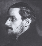
Conventionally, book illustration has worked with a basic trio of strategies: Character-based, environment-based and event-based. These provide a choice of starting points when considering how to image text. However, for me and I must assume that for many readers of The Wake, an aspect of the reading experience is to be conscious of the labour involved in its writing, its ambition, the process of construction and elaboration, the reiteration of its own content and that of its pre-texts i.e. Joyce’s own literary output up to that point. Therefore the selection of basic illustrational strategies must be extended to include the representation of authorship, portrayal of the author. I agree with Hayes’ on the potential value of exploring this approach (7), particularly in the case of Joyce and specifically with regard to Finnegans Wake.
A further extension to conventional approaches could involve representation of narrative text as an abstract whole, signifying mood or structure. We are familiar with this function in relation to book jacket design. Here there is usually a default to one of the original three strategies or the formal aspects of colour, typographic composition etc. or, indeed, use of the authors name to summarise the promise of the text. Abstract illustration as a non-figurative representation of the whole text is less common but could be appropriate in visualising The Wake, with its sense of night, interiority, surface rhythm and flow and what some consider its fractal qualities.
The definition of illustration as illumination is useful in several ways in relation to The Wake. Here is a night book, written in a dream language, which at first may seem as hermetic as a sleeping head. The opacity of its face resists and fascinates. Imaging this night river of words might provide alternative points of access or anchorage for the reader, drawing out and foregrounding the latent visuality of the text. Illustration as illumination also points to the notion of textual, textural elaboration in Finnegans Wake. Joyce’s identification of the Book of Kells as a kind of model for the Wake has obvious significance here. The letters and words of key pages of the book of Kells (the TUNC page in particular) are buried or camouflaged amidst a swirling, layered mass of pattern and motif attesting to the once common, now divided, roots of the disciplines of pictures making and word making. The deliberate connection of The Wake with illuminated pages also retrieves it from too close an association with purely modernistic devices, placing it in a much deeper tradition. There is a compelling resonance between the complex exfoliation of symbolic, pictorial and decorative elements around and within the formal structure of initial letters and the dense self-referential elaborations of Joyce’s text. Joyce also makes extensive and complex use of initials throughout the book. As a visual practitioner I find the close parallels between the Book of Kells and Finnegans Wake particularly striking and certainly more compelling and beguiling than Litz does in his analysis of them as rationale for ‘Joyce’s interminable elaborations’(8).
An established function of illustration from its early history in illuminated manuscripts is as a means of secularizing text, contrasting directly with its simultaneous function of beautification and its role in the production of transcendent, apparently super human artefacts. As figuratively decorative elements of visual narrative emerged and eventually separated from the exquisite elaborations, so the authority of the single, privileged interpreter weakened. A viewer of the illustrated page did not have to read the text to grasp its narrative and the work took on an aspect of having been produced by man rather than by angels. In this sense illustration became a means by which text can be centralized. An alternative, contradictory view of the value of illustrative depiction may be found in its iconicity. There is a sense in which illuminated pages, through the very nature of their appearance, hold the qualities of what they represent. This concept could underpin attempts to produce abstract visual response to Finnegans Wake which have qualities of the original text.
The origins of figurative art are directly and intimately connected with speech. They appear to be closer to writing than to ‘works of art’ as such. Millennia of linear writing resulted in a separation of pictorial image making from the practice of writing. Writing, a linear arrangement of marks, subordinated graphic expression to phonetic expression, until the current situation was arrived at in which speech and graphic expression co-exist without subordination. However, in this accommodation there is still widespread distrust between image and speech. The use of images with text is accepted in education, for instance, or for transmission to popular markets, but their use in literature has persistently been assumed to be of questionable value. Traditionally, of course, the code of writing was preferred as a means of maintaining hierarchy because limitations could be placed on its teaching. Image and text are centripetally pulled together because of their shared configuration yet constantly tend to centrifugally separate.
In Finnegans Wake Joyce makes peculiarly explicit the malleability of words. This attitude to the stuff of his practice is a very familiar one to the visual practitioner, where distortion, elaboration, fragmentation, assemblage, montage, layering of images and the incorporation of chance etc. are routine procedures. Joyce deployed techniques ranging between, apparently, random distributions of words and an excruciatingly pedantic, over-deliberated, over-determined refinement. I find it interesting how this chimes with contemporary ideas about craft in the digital age. In his lecture Digital Craft, given to design students in 2007, Professor David Crow called for a reclamation of term ‘craft’ to include the manipulation of digital information, coding, programming etc. by artists and designers experimenting with these languages – getting there hands into data as if it were material. He outlined the historical course by which, under the influence of modernism, art became an intellectual endeavour whereas craft became increasingly associated with tools and processes. Contemporary artists and designers are now able to range across materials and processes, often using what they come across in other fields and from other times. There is a constant dialogue between design and process. Designers and makers are permitting themselves to ‘break’ normal processes, produce accidental variables and play, ignoring ‘default’ settings. The accidental can be at the heart of craft when the programmer is the craftsperson. It seems to me that in so radically extending the craft of his writing through practical experimental process, Joyce treated words and language themselves as material to be manipulated - coerced, bent, broken, reassembled in new configurations, as if using the system of Finnegans Wake as creative meta-tool.
Wakemap-aWakemap-b
Wakemap-c